You are currently browsing the tag archive for the ‘Creativity’ tag.
Presenting Data can be boring for the audience.
I often see speakers shows rows and rows of plain number. Zzzzzz! I can hardly stay concentrated on the presentation.
To help our audience stay focus and understand the data and we better use data visualization.
I already discuss about charts in “To boldly go beyond pie chart”. Today, I want to share some examples of creative data Visualization.
- How Different Groups Spend Their Day – The New York Times
It is an innovative display of data and it is fun the play with the different category. Click on the link and try it
Thanks to @presentationzen for inspiring me this post with his tweet about the NYTimes.
- Dozens of Data Visualization examples | Smashing Magazine
For dozens of cool examples of data visualization to inspire you, visit this post by Smashing Magazine: Data Visualization: Modern Approaches
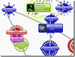
Here a few examples:
Share with me: How do you visualize the data for your audience? Are you creative?
Posted by Denis François Gravel
Related post: To boldly go beyond pie chart.
Return to front page
Presenting data is more efficient with visual aids. Pie charts and bar graph are used everyday in presentations, meetings or reports.
We are used to them…..and sometimes bored by them. They often looked all the same.
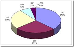
This is a regular pie chart. The kind we sees regularly in presentation. This one is about Star Trek fans preference.
Questioned fans indicate « The Next Generation » as their prefer Star Trek (this detail is not related to my point. It is just to satisfy your curiosity). Source : Trekmovie.com
It is possible to add some creativity in the data presentation. If you have a creative visualization, you will keep your audience attention instead of boring them.
I suggest that you boldly go beyond pie chart (I am influenced by the last Star Trek movie. I loved it)
To help you, here is some examples of data visualization that goes beyond pie chart
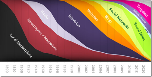
This graph indicate the evolution of media: “we are going to take a little tour through the history of information, or more specifically, where to focus your efforts if you want get in touch with other people”
Source: baekdal.com
If the world was village of 100 people, is a series of world’s statistics. The creativity of the visual is obvious.
More here : The World of 100
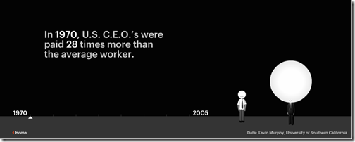
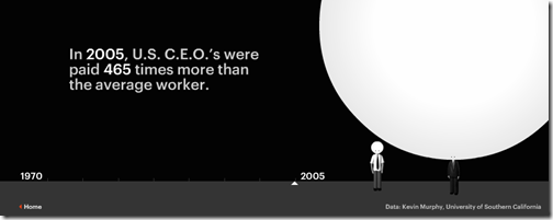
The last example illustrate the evolution of the difference of salary between an average worker and a CEO from 1970 to 2005. I am not an economy specialist, but it help me understand one of the problem that led to the actual crisis.
Source: portfolio.com
Before ending this post, I added those to pictures of Star Trek. They have inspired the title: To boldly go beyond pie chart.
Those images are powerful. They capture the personality of Kirk and Spock. Enjoy them in full screen by clicking on them.
Share with me: What creative visuals did you use lately?
Posted by Denis François Gravel


